Forms
Forms enable users to create custom structures for filling, collecting, and displaying various data. By using simple drag and drop functionality implemented in the system, you can create different forms with no programming skills required whatsoever. Forms represent a modeling environment, independent and usable for an indefinite number of processes and applications.
Forms page
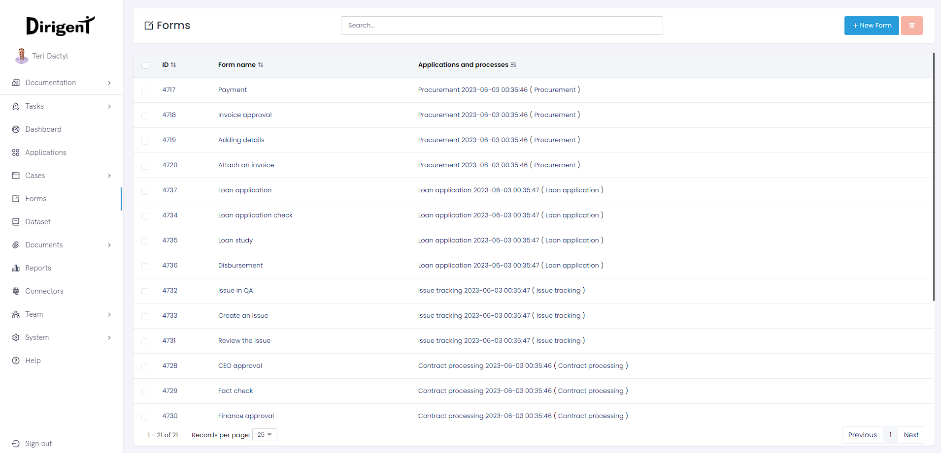
On the main forms page, you can create a new form by clicking the + button, search through all forms created by using the search field, and browse forms displayed as a list with a predefined number of results per page that you may choose from. In Dirigent, forms can be used in two ways, as a part of the user task, or as a process form.
Create a new form
To create a new form, click the + New form button and fill in the required details. Any form that has been created will open as a blank form, meaning you can get straight into adding components and formating the form to your needs.
Delete a form
You can delete a form from the forms page by checking the checkbox located on the left of the table. Once the form/s for deletion are checked, just click the delete button.
Forms that are a part of a an existing application or a process cannot be deleted!
Form page
This is the page containing all necessary information about an individual form. Form builder is located here, allowing you to create powerful user forms easily. In the header of the page, along the information about the form are basic action buttons Save, Save as, Edit and Delete.
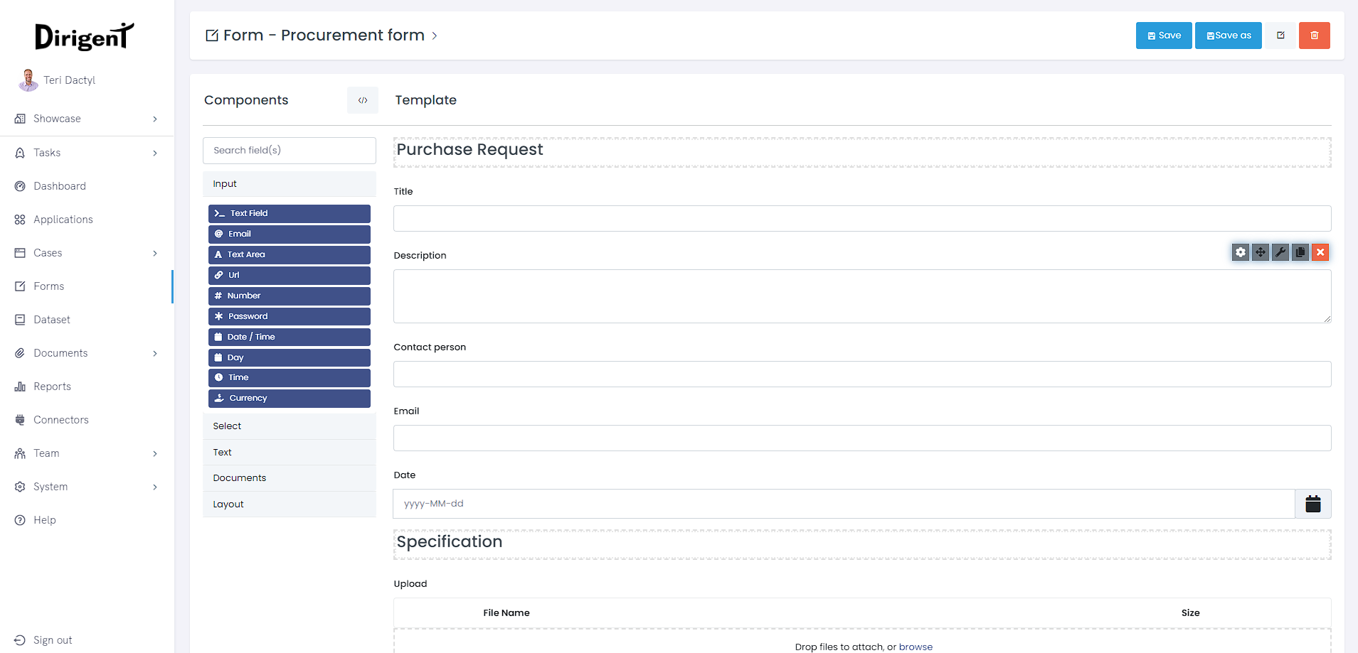
Form builder
Form builder consists of the component pallete on the left, and the canvas on the right. The pallete consists of 5 sub-groups which are: Input, Select, Text, Documents, and Layout.
Before learning about the various components Dirigent provides, it's important to first understand the settings behind these components. While many components offer unique settings specific to the component type, there are many settings that span across the majority of components. These settings are referred to as General settings. Below is a list of these settings organized by setting type.
Display settings
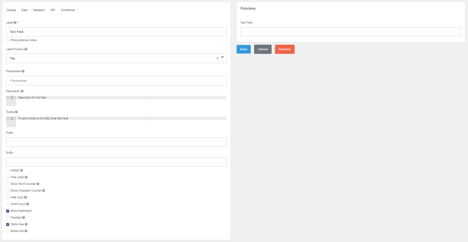 Display settings are settings that modify the front-end UI of a component. The Display setting tab will be the first tab open when editing the component settings. Any changes made will be reflected on the component preview.
Label
The front-end name for the component. By default, the label will display left-aligned, above the field.
Show previous value
Remembers the value that has been inputed in the field, so the next time user returns to the form, that value will be set as the default value.
Label Position
Location of the component's label. The lable position will default to the top option, but several other options can be selected:
| Position | Description |
|---|---|
Top |
Displayed to the left of the component and aligned to the left of the component |
Left (left-aligned) |
Displayed to the left of the component and aligned to the right of the component |
Left (right-aligned) |
Displayed to the right of the component and aligned to the left of the component |
Right (left-aligned) |
Displayed to the right of the component and aligned to the left of the component |
Right (right-aligned) |
Displayed to the right of the component and aligned to the right of the component |
Bottom |
Displayed left aligned on the bottom |
Using a left-aligned label position.
By using a left-aligned label position, you can create a more compact and efficient form layout that saves vertical space and allows more fields to fit on a single screen. Alternatively, using a top-aligned label position can help create a more traditional form layout that may be more familiar to users. Ultimately, the choice of label position will depend on the specific needs and constraints of your form, as well as the preferences and expectations of your users.
Placeholder
This is a brief description that explains the anticipated value that should be entered by the user in the field. The Placeholder will appear when the field is blank and will not be transmitted to the server upon submission of the form..
Description
You can add a Description that will be displayed below the field by using this setting. It can be used either as a replacement for the Placeholder or in conjunction with it, to provide additional details that are relevant to the field.
Tooltip
When you add content to the Tooltip setting, a new UI element represented by a question icon will be added to the field. If a user hovers over the UI element, the content within the Tooltip setting will be displayed. Tooltips are a useful method of providing detailed instructions or helpful tips without utilizing additional space on your form.
Prefix
With the Prefix setting, you can add text or characters before the input field. This is helpful for categorizing or labeling a field, such as using the $ sign for US currency.
Sufix
The Suffix setting enables the addition of text or characters after the input field. This can be helpful for categorizing or labeling a field, such as using % to denote a percentage.
Hidden
Hidden components are not visible on the form, but they still exist within the form JSON and submission. You can utilize Hidden components to enable conditional show and hide workflows, by configuring Logic settings accordingly.
Hide label
Hides the label of a field. Save vertical space on a form by hiding the field label and utilizing other display settings such as a Placeholder to identify the field.
Show word counter
A feature that displays the number of words entered in a field below the input area. This option enables users to track the length of their content in real-time, which can be helpful for ensuring that it meets specific requirements.
Show character counter
A feature that displays the number of characters entered in a field below the input area. This option enables users to track the length of their content in real-time, which can be helpful for ensuring that it meets specific requirements.
Hide input
This setting masks the input of a field by replacing characters with circular characters, as is commonly seen in password fields. It's useful for handling sensitive information such as Tax ID or Social Security Number.
Hide Input does not encrypt the data on the server.
While the Hide Input setting does obscure the entered text with dots, the underlying data is still transmitted and stored in plain text format. This means that the data can potentially be intercepted and read by unauthorized parties, making it unsuitable for storing sensitive information.
Initial focus
The component with the "Initial Focused" option selected will become the focused element on the form when it is rendered.
Only one component on the form should have the Initial Focus setting enabled
If multiple components have this option selected, only the last component in the JSON structure with the setting enabled will be focused on the form, potentially causing confusion for the user. Therefore, it's recommended to use this setting judiciously and avoid enabling it for multiple components.
Allow spellcheck
When this option is enabled, users can see misspelled words highlighted in red as they type. This can be especially helpful for fields that require accurate spelling, such as email addresses or other contact information.
Disabled
When a field is set to "Disabled," users won't be able to interact with it, including focusing and entering data. This setting is useful for preventing users from modifying values or calculations that are automatically populated based on other fields or logic.
Table view
Enabling the "Table View" setting causes the field and its associated data to be displayed within the Submission Data Grid of the form. This view can be useful for quickly scanning and comparing data across multiple submissions. It's important to note that the data will still be saved to the server regardless of whether this setting is enabled or not.
Note
Enabling this option may impact the layout of the form, and could potentially affect the user experience.
Modal edit
Clicking on the field will open a Modal Window where users can input or edit the field data. If the field is empty, the placeholder text "Click to set value" will be displayed to prompt users to enter data. This approach can be useful for fields that require additional input or validation beyond what can be provided in a simple input box.
Tip
By using a Modal Window, you can present users with a dedicated space for entering and reviewing data, while keeping the overall form layout clean and uncluttered. However, it's important to design the Modal Window carefully to ensure that it is intuitive and easy to use, and doesn't disrupt the overall flow of the form.
Data settings
Multiple Values
When the Multiple Values setting is enabled for a component, it adds an "Add Another" button below the field, allowing users to input and manage multiple instances of the same component. This is useful when collecting data such as multiple phone numbers, email addresses, or addresses.
The user can click the "Add Another" button to create a new instance of the component, and remove individual instances using a delete button.
How is the data saved?
The data entered into these instances is saved as an array within the submission, making it easier to process and analyze the data after submission.
Default value
The Default Value setting allows you to set the initial value for a field, which will be displayed when the form is first rendered. This is useful when you want to pre-populate the field with a default value, such as a placeholder or a previously entered value. If the user doesn't change the default value, it will be saved with the submission data.
By setting a default value, you can speed up the data entry process and ensure that your forms are filled out consistently. However, it's important to note that the default value can be changed by the user.
Text case
The Text case setting allows you to modify the case of the data entered into a field. This can be useful for standardizing the formatting of data, such as converting all text to uppercase or lowercase.
Redraw
The Redraw setting allows you to refresh a component when a specific event occurs. This can be useful for ensuring that a component displays up-to-date information based on changes made elsewhere in the form. The Redraw setting provides a dropdown menu with options for when to refresh the component: it can be set to redraw whenever any change occurs on the form, or to redraw only when a specific field on the form is changed
Tip
Keep in mind that redrawing a component can cause it to lose any user-entered data, so use this setting with caution and ensure that the component's behavior after a redraw is consistent with the user's expectations.
Validation
Required
The Required setting indicates that a value must be entered in the field before the form can be submitted or the user can progress to the next task. This setting is useful for ensuring that all necessary information is collected from the user.
Error label
The Error Label setting allows you to customize the name of the field that appears in the validation message when an error is triggered. You can change this field name to make the message more descriptive and user-friendly.
Custom error message
This setting allows you to provide a specific error message that will be displayed to the user when the component fails validation.
To set a custom error message, you can edit the component in question and locate the "Custom Error Message" setting. Enter the desired message, such as "Please enter a valid email address" or "This field is required", and save your changes. When validation is triggered and the component fails validation, your custom error message will be displayed instead of the default message.
Minimum/Maximum length
The Minimum or Maximum length setting specifies the minimum or maximum number of characters required for the field value to meet the validation criteria. The specific behavior of this setting may vary depending on the type of component it is applied to:
- String (Text field, Text area) - Determined by the number of characters entered in the field
- Number (Number, Currency) - Determined by the numerical amount entered in the field
- Array (Data grid, Select) - Determined by the number of arrays added to the component
Regular expression pattern
Regular Expression Pattern (often referred to as Regex) is a powerful setting that allows you to define a pattern or filter for a field's value. The pattern is defined using a series of characters and symbols that represent a set of rules for matching and validating input data. With a Regex Pattern set, the input data must match the defined pattern before the form can be submitted.
How can I use Regular expression pattern in my form?
You could use Regex to ensure that an email address entered into a field is properly formatted, or to enforce a certain pattern for a password (such as requiring a minimum number of characters, including uppercase and lowercase letters, and special characters).
API
Property name
The back-end field identifier for the API endpoint. This field is auto-populated in camelCase based on the initial Label given to the field. Each field's Property Name must be unique on the form before the form can be saved.
Use the Property Name when referencing the value of the component.
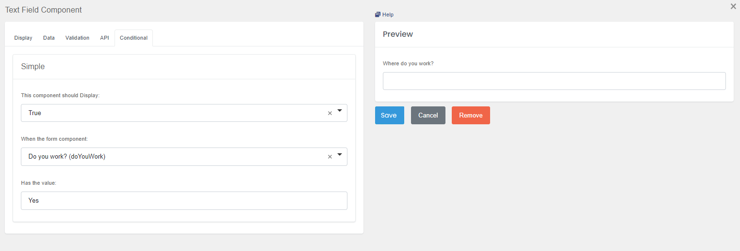
Conditional
Dirigent's Conditions system enables you to create intelligent workflows that respond to user interactions on the form. With this system, you can dynamically show or hide fields based on user input, merge component JSON schema, conditionally set field settings, and more.
In the example below, our text input component Where do you work? will be displayed in the form, only if the answer on our other text input component Do your work? is Yes.